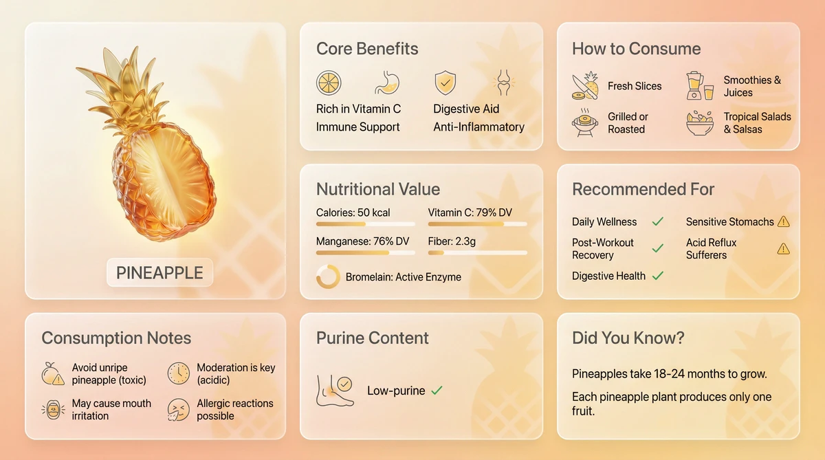
Modern Bento-grid product showcase design using frosted acrylic transparent glass material. Suitable for any product type (food / pharmaceuticals / tech products / chemical elements, etc.). Layout Structure: 8 modules arranged in an asymmetric Bento grid, horizontal landscape format. Module 1: 3D Glass Product Hero Display (medium 1×1 size, occupies 20–25% of space) A 3D sculpture of [Product Name] made from transparent glass or acrylic [Product-specific features]: • Food → Cross-section/internal structure (e.g., tomato seed chambers, carrot cross-cut) • Pharmaceuticals → Transparent glass representation of pills/capsules • Tech → Artistic glass interpretation of product exterior Material effect: Tinted glass in [product’s primary color]—red-orange, blue, green, etc.—with glossy surface, light refraction, and realistic reflections Text label directly below: “[English Name]” Compact footprint to leave ample room for information modules Module 2: Core Benefits / Features (standard 1×1 card) Title: “Core Benefits” / “Key Features” / “Main Functions” Content: 4 key selling points separated by “/” (examples provided in original) Paired with minimalist icons Module 3: Usage / Application Scenarios (standard 1×1 card) Title: “How to Consume” / “How to Use” / “Use Cases” Content: 4 usage methods or scenarios (examples provided) Paired with contextual icons Module 4: Key Data / Specifications (standard 1×1 card) Title: “Nutritional Value” / “Technical Specs” / “Product Details” Content: 5 critical data points (examples provided) Paired with subtle data visualization charts Module 5: Target Audience / User Profile (standard 1×1 card) Title: “Recommended For” / “Target Users” / “Ideal For” Content: Split into recommendations (✓) and cautions (⚠️) (examples provided) Use green ✓ and amber ⚠️ for visual distinction Module 6: Precautions / Guidelines (standard 1×1 card) Title: “Consumption Notes” / “Usage Warnings” / “Important Reminders” Content: 4 essential cautionary notes (examples provided) Paired with warning icons Module 7: Special Metrics (standard 1×1 card) Title adapts by category: • Food → “Purine Content” • Pharma → “Side Effects” • Tech → “Compatibility” Content: Specific metric + judgment tag (e.g., “Low-purine ✓”) Paired with indicators or icons Module 8: Fun Facts / Product Insights (standard 1×1 card) Title: “Did You Know?” / “Product Story” / “Interesting Facts” Content: 2–3 engaging trivia points (examples provided) Frosted Acrylic Material Specification (CRITICAL – Core Essence): Transparency: 80–85% translucent — background visible through cards Frosted effect: Soft frosted-glass blur (backdrop-filter style) Base tone: Slight white/cream frosting (15–20% opacity) for readability while preserving translucency Border: Thin luminous edge that catches light reflections Shadows: Soft layered drop shadows for floating depth Glass physics: Realistic edge highlights, light refraction, and surface reflections Visual trait: Background gradient clearly visible through cards, mimicking real frosted acrylic panels Crucial: Cards must remain TRANSLUCENT — never opaque white! Color Scheme: Base ratio: 90% neutral tones + 10% product-themed accent Base layer: Transparent glass, light gray, off-white Text color: Medium-dark gray #3A3A3A (soft yet legible on translucent background) Accent color (used only on key icons, numbers, warnings, 3D object): • Food → Natural hues (tomato red-orange, carrot orange, spinach green) • Pharma → Medical blue, pharma white, red-cross red • Tech → Brand colors (Apple silver-blue, Xiaomi orange, Huawei red) Warning color: Amber orange #FF9800 (for ⚠️) Positive color: Green #4CAF50 (for ✓) Background Setting: Type: Soft 2–3 color gradient Tone adaptation: • Food → Cream-white → pale peach → light orange (warm) • Pharma → Light gray-white → pale blue → clinical white (clean/professional) • Tech → Space gray → silver-white → soft blue (tech-forward) Decorative elements: Extremely subtle abstract shapes, faintly visible through glass Important: Background must be unobtrusive — visible through cards but never distracting Typography & Layout: Format: Horizontal landscape (16:9 or similar) Grid: Asymmetric Bento layout with varied card sizes Space allocation: 3D hero = 20–25%; 7 info cards = 75–80% Spacing: Generous whitespace for visual breathing room Hierarchy: Established via card size, position, and color accents Reading flow: Starts at top-left 3D object, flows naturally to info cards Text Guidelines: Language: Full English (product name may include English subtitle) Font hierarchy: • Module titles: Bold, large • Body text: Regular, medium • Data values: Bold for emphasis Legibility: Medium-dark gray text remains crisp on frosted glass Units: Grams/mg, kcal, minutes/hours, mL/L — standardized Icon Style: Minimalist line icons Small scale, non-distracting Color: Light gray lines; key icons accented with theme color Purpose: Visual reinforcement, not decoration Usage Instructions: Replace [Product Name] with actual product Select content template based on category (food/pharma/tech) Populate all 8 modules with specific details Adjust accent color to match product identity Preserve frosted acrylic translucency throughout Quality Checklist: ✓ Correct transparency (80–85%, background visible) ✓ Noticeable but restrained frosted blur ✓ Background clearly seen through cards ✓ 3D object sized appropriately (20–25%) ✓ All 8 modules fully populated ✓ Clear Chinese typography ✓ Elegant color restraint (90% neutral + 10% accent) ✓ Comfortable, uncrowded layout ✓ Authentic glass rendering (highlights, reflections, refractions) Example Applications: Food: 🍅 Tomato, 🥕 Carrot, 🍎 Apple, 🥑 Avocado Pharma: 💊 Aspirin, Vitamin C, Ibuprofen, Penicillin Tech: 🎧 AirPods Max, iPhone, MacBook, Tesla Elements: ⚛️ Carbon, Oxygen, Hydrogen, Nitrogen Theme food: pineapple
Model
Nano banana pro
Resolution
2752 × 1536 px