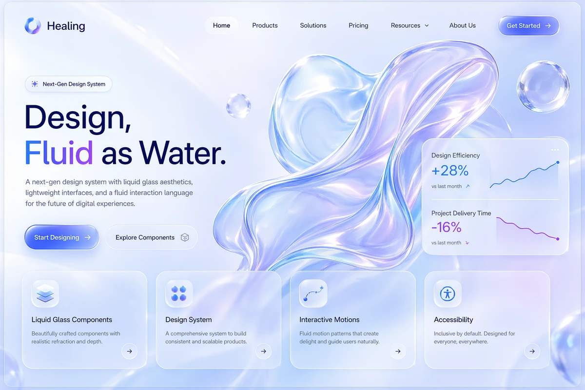
Generate a high-fidelity Healing homepage design for a brand’s official website, presented in a 16:9 widescreen layout. The visual style is Liquid Glass, conveying a premium, futuristic, airy, and translucent tech aesthetic. This is the full above-the-fold section of the homepage, designed to be portfolio-ready for design communities and product website proposals. The overall background uses a soft gradient of light blue, misty white, and pale lavender, with large, fluid liquid-glass textures that resemble a blend of translucent jelly and polished acrylic, featuring realistic refraction, reflection, specular highlights, edge glow, and subtle blur. Slightly off-center to the right is a large, abstract fluid-glass visual, like slow-moving transparent liquid silk with an iridescent blue-purple sheen. Surrounding it are a few floating transparent bubbles and glass spheres to enhance spatial depth. At the top is a minimalist navigation bar: on the left, a brand icon and the brand name in English; on the right, navigation items in English such as “Home,” “Products,” “Solutions,” “Pricing,” “Resources,” and “About Us,” with a prominent “Get Started” button at the far right. The main title area is on the left, featuring large English typography with a headline like “Design, Fluid as Water.” The typeface is modern, clean, and breathable. Below it is an English subheadline introducing a next-gen design system, lightweight interface experience, and fluid interaction language. Two buttons sit beneath the title: “Start Designing” and “Explore Components,” both designed with glassmorphism and soft highlights. Floating mid-right on the page is a semi-transparent data card showing simple charts and English metrics, such as “Design Efficiency +28%” and “Project Delivery Time -16%.” The card has frosted glass blur, soft glowing borders, and a subtle drop shadow. At the bottom of the screen, four feature cards are arranged horizontally, labeled in English: “Liquid Glass Components,” “Design System,” “Interactive Motions,” and “Accessibility.” Each card uses large rounded corners, semi-transparent glass material, minimalist icons, and a short English description. The overall layout adheres to real-world Figma high-fidelity UI standards, with a clear grid, generous whitespace, distinct hierarchy, and meticulous detail. The style blends Apple-like futurism with high-end SaaS homepage visuals. The image is ultra-clean, emphasizing authentic UI texture, glass material details, modern English typography, and a product-grade homepage atmosphere. Avoid clutter, low-quality illustrations, and excessive decoration. The result must be ultra-high-definition, refined, professional, and directly usable as a homepage visual reference.